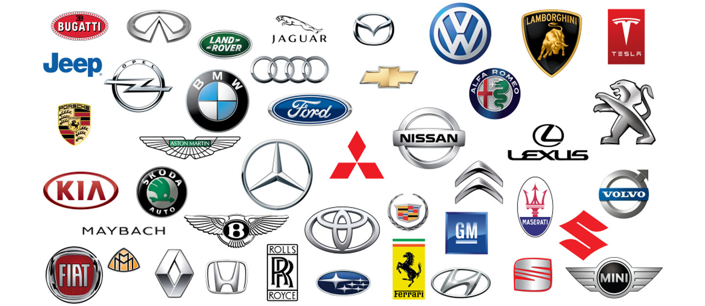
When it comes to cars, enthusiasts and casual drivers alike often first notice the logo emblazoned on the front grille. Car logos are more than just a symbol; they represent the heritage, values, and aspirations of the automotive brands they belong to. These emblems often carry rich histories, profound meanings, and intricate designs that captivate and inspire. In this article, we’ll explore the fascinating world of car logos, diving into their histories, designs, and the stories behind some of the most iconic emblems on the road today.
The Evolution of Car Logos: From Simple Emblems to Iconic Symbols
Car logos have come a long way since the early days of the automotive industry. Initially, logos were simple and functional, designed to be easily identifiable from a distance. Early car manufacturers focused on basic designs that could be quickly recognized by consumers. Over time, these logos evolved, incorporating more intricate designs and deeper symbolism.
The Early Days: Function Over Form
In the early 20th century, car logos were straightforward, often featuring the manufacturer’s name or initials. Companies like Ford and Chevrolet adopted simple, bold lettering that made their vehicles easily identifiable. These early logos were all about functionality, ensuring that even from a distance, a car’s brand could be quickly recognized.
Mid-Century Modern: Design Meets Symbolism
As the automotive industry matured, so did the design of car logos. The mid-20th century saw a shift towards more stylized and symbolic logos. For instance, Mercedes-Benz introduced its famous three-pointed star in 1926, symbolizing the brand’s dominance over land, sea, and air. This era marked the beginning of logos being used not just for identification, but also to convey a brand’s values and aspirations.
Contemporary Logos: A Blend of Tradition and Innovation

Today’s car logos are a blend of tradition and modernity. Brands like BMW and Audi have retained elements of their original designs while incorporating contemporary aesthetics. These logos often use sleek lines, metallic finishes, and three-dimensional effects to stand out in a crowded market. The evolution of car logos reflects broader trends in design and branding, showing how companies adapt to changing tastes while staying true to their roots.
Iconic Car Logos and Their Stories
Every car logo has a story, a reason behind its design, and a meaning that often goes beyond aesthetics. Let’s take a closer look at some of the most iconic car logos and uncover the fascinating tales behind them.
Mercedes-Benz: The Star That Shines Bright
The Mercedes-Benz Car Logos is one of the most recognizable car emblems in the world. The three-pointed star, enclosed in a circle, is a symbol of the company’s vision of universal motorization. Each point of the star represents a domain of motorization: land, sea, and air. This logo was first used in 1926 and has undergone minimal changes, reflecting the brand’s commitment to its legacy and vision.
The story goes that the founder, Gottlieb Daimler, used to draw a star on the postcards he sent to his wife, symbolizing his wish for prosperity. This personal touch became a powerful brand symbol, embodying the company’s pioneering spirit and quest for excellence.
BMW: A Propeller or a Bavarian Flag?
BMW’s Car Logos is often thought to represent a spinning airplane propeller, reflecting the company’s origins in aircraft engine manufacturing. However, this interpretation is only partly true. The blue and white quarters of the logo actually represent the colors of the Bavarian flag, the home region of BMW. The logo, introduced in 1917, combines these elements to honor the company’s heritage while also alluding to its technological prowess.
This dual meaning has helped the BMW logo become a powerful symbol of German engineering and innovation, recognized and respected worldwide.
Ferrari: The Prancing Horse of Victory
The Ferrari logo, featuring a prancing horse on a yellow background, is synonymous with speed, luxury, and Italian excellence. The horse was originally the emblem of Italian fighter pilot Francesco Baracca, a national hero in World War I. Enzo Ferrari, the founder of Ferrari, was given permission by Baracca’s family to use the emblem, hoping it would bring good luck.
The yellow background represents Modena, Ferrari’s hometown, while the colors of the Italian flag sit proudly above the horse. This logo is not just a brand mark; it’s a tribute to Italian history, passion, and the relentless pursuit of victory on the racetrack.
The Psychology of Car Logos: What Do They Really Mean?
Car logos are designed not just to be visually appealing but also to evoke certain emotions and perceptions. The shapes, colors, and symbols used in these logos are carefully chosen to convey specific messages and values.
Shapes and Symbols: More Than Meets the Eye
The shape of a car logo can say a lot about a brand. Circular logos, like those of BMW and Volkswagen, suggest inclusivity and unity. Angular designs, like the Chevrolet bowtie, convey stability and reliability. The use of stars, wings, and animals often symbolize excellence, freedom, and power, respectively.
